‘Destination Ladakh’ logo unveiled, gives new visual identity to UT Tourism
Lieutenant Governor of the Union Territory of Ladakh, Kavinder Gupta, on December 18 unveiled the “Destination Ladakh” logo, marking a significant step toward strengthening Ladakh’s tourism identity through a unified and meaningful visual representation.
The new logo has been designed by Team Stringmo, a young collective of artists from Kargil, and introduced by the Department of Tourism, Ladakh as part of the UT Administration’s efforts to position Ladakh prominently on the global tourism map.
The ‘Destination Ladakh’ logo presents a distinctive visual identity deeply rooted in the region’s authenticity, cultural richness and unique sense of place. It draws inspiration from Ladakh’s pristine landscapes, ancient traditions, spiritual heritage and the resilient way of life of its people.
Explaining the conceptualisation and design process, members of Team Stringmo elaborated on the cultural symbolism, artistic elements and visual philosophy behind the logo. They said the design aims to project Ladakh as a responsible, authentic and globally appealing destination, while remaining firmly grounded in traditional values and ecological sensitivity.
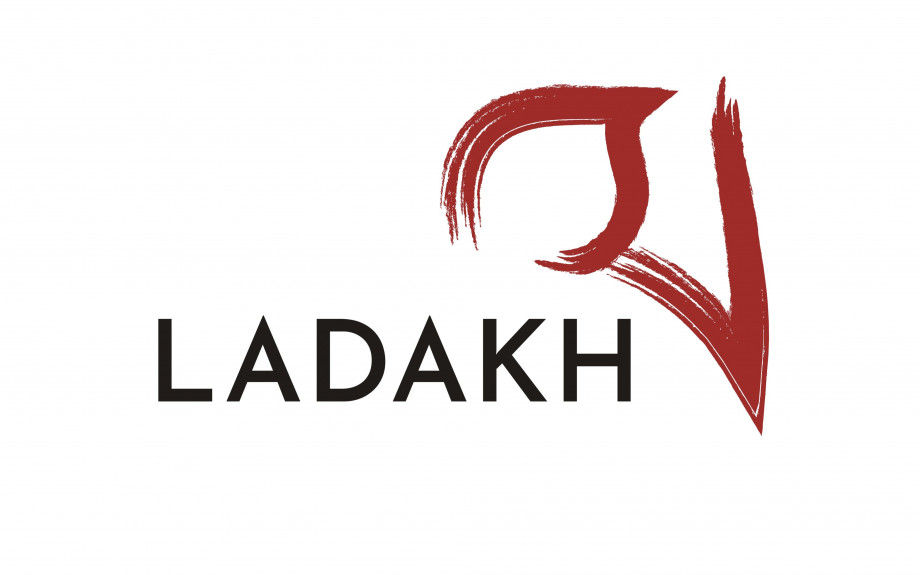
Team Stringmo explained that the logo features the Bhoti letter “La” at its centre, chosen for both its linguistic relevance and deep symbolic meaning. In the Ladakhi language, La means “pass,” an element intrinsic to the region’s geography, mobility and identity. The name Ladakh itself originates from La, reflecting the importance of mountain passes that have historically served as routes of trade, cultural exchange, migration and resilience.
Kaneez Fatima, Team Leader, Stringmo, said the use of La represents a unifying motif that transcends regional distinctions, sectarian lines and cultural variations across Ladakh, symbolising shared heritage and continuity.
She further explained that the logo’s colour palette, dominated by a deep red hue, carries historical significance as Ladakh was traditionally known as Maryul, meaning the “Red Land,” derived from the reddish tones of its mountains and terrain. Rendered in a bold yet graceful brushstroke, the design evokes Ladakh’s natural textures and geological formations. The colour red also conveys warmth, vibrancy and the spirited hospitality of Ladakhi people, serving as a timeless and culturally neutral visual anchor.
Beyond its aesthetic appeal, the logo encapsulates the narrative of a people who have endured, adapted and flourished in one of the world’s harshest environments. The organic brushstroke reflects generations who crossed high passes for livelihoods, traders who traversed historic routes, and communities that have safeguarded their land over centuries. The visual language also subtly pays tribute to Ladakh’s patriotic legacy and its contribution to national strength through courage and service.
As a tourism identity, the logo serves as both a symbol and an invitation. Interpreted as a “pass,” the letter La becomes a metaphorical threshold to exploration, adventure and transformation. It portrays Ladakh not merely as a destination, but as a living experience that invites travellers to journey across landscapes, cultures, stories and time.
The unveiling of the Destination Ladakh logo marks a major milestone in the UT Administration’s efforts to reposition Ladakh as a distinctive tourism destination that offers immersive experiences, supports local livelihoods and celebrates its unique cultural and natural heritage.
The logo embodies the essence of Ladakh—where enduring traditions blend seamlessly with subtle modernity—reflecting the simple, grounded and balanced way of life practised by its people.
-
 Reach Ladakh Skara Yokma, Airport Road, Near Councillor Quarter, India.


© 2018 Reachladakh. All rights reserved.
Web designs By : India Internet